

Visual Identity and Packaging Design of Green Teant
Cold Tea and Packaging Branding
This project was selected to receive a Best Design Award from DesignRush, a trends and awards platform that has laureled brands such as Prada, FIFA, Fenty, Sefa Spices, and many others..
Fresh, lively, and utterly unique
Green Teant is a tea brand grounded in a very simple idea. They wanted their products to feel close to nature without turning that into a fantasy. The blends already carry their own character, so the brand needed to echo that honesty.
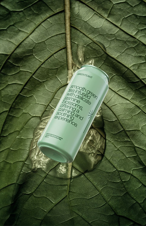
The visual direction follows the same mindset. Clean, calm, and centered on the ingredients, giving space for the natural textures and colors of each tea to appear. No overstated narratives. Just a straightforward way of presenting what they do well.
The result is a brand that feels steady and minimalist. Each can highlights the personality of the blend inside and the care behind it. A visual system that respects the product and lets the experience speak through flavor, aroma, and simplicity.
The Creative Solution
Our approach focused on creating a harmonious brand system using Helvetica in all caps—a fine, timeless font that exudes sophistication without unnecessary elements. The design for each can showcases the essence of each tea flavor with thoughtful typography that tells a story of exploration and nature’s diversity. By employing a palette inspired by natural greens, we balanced minimalism with an organic feel.


Challenges
Green Teant aimed to achieve a minimalist aesthetic that highlighted their commitment to nature, while also standing out in a competitive market. We needed a visual identity that was clean yet impactful, featuring colors and typography that would bring out the distinct flavor profiles in each can.


