Visual Identity and Packaging Design for Tanuii Coffee
Specialty Coffee Branding
Pure Flavors, Genuine Moments: Where Every Sip Matters
Tanuii is a coffee brand shaped by people who genuinely care about where their beans come from and how they taste. Instead of building a grand narrative, the focus stays on the journey behind each roast and the care put into selecting it.
Their beans come from farms from Costa Rica’s high altitudes to Sumatra’s dense, shaded fields. The sourcing is treated as a marketing hook and as a way of respecting the work behind every harvest.
The blends carry their own character. Some are soft and rounded, others brighter and more layered, but all of them are chosen to give a straightforward, honest coffee experience. Tanuii’s role is simply to bring those profiles forward without dressing them up.
The Creative Solutions
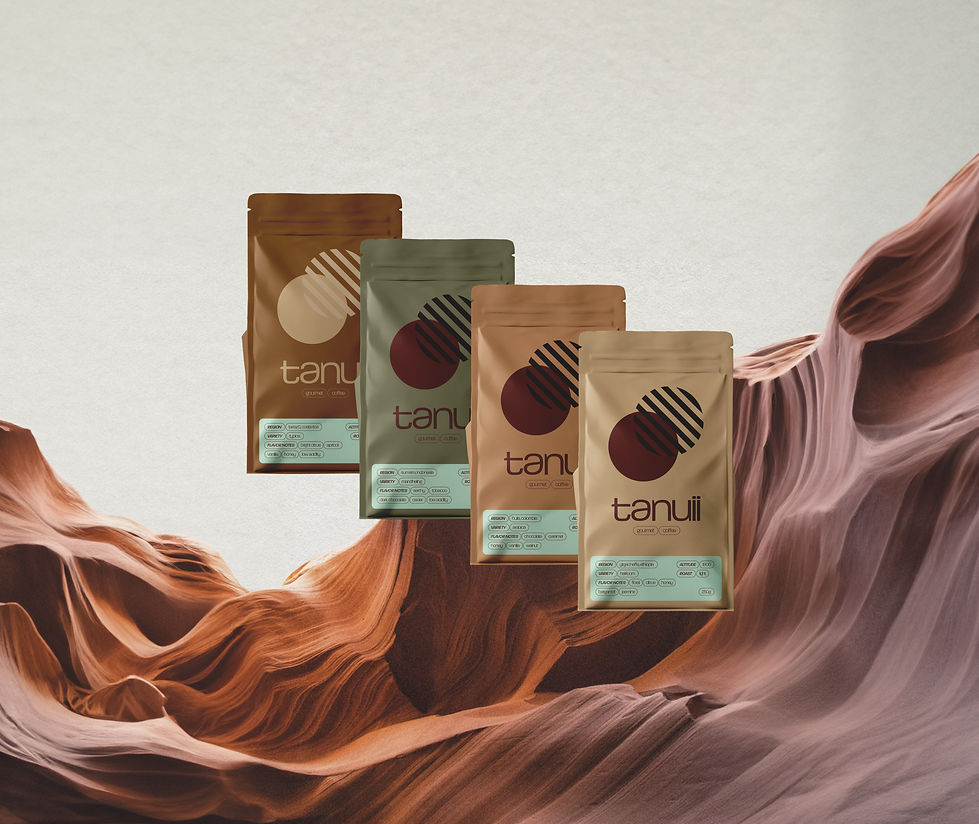
To achieve this vision, we developed a streamlined, minimalist brand identity. The logo features lowercase typography in a unique, sophisticated font, which adds a contemporary feel to the brand. The color palette is composed of muted pastels, adding warmth and calmness to the design while allowing the packaging to stand out on shelves without overwhelming the visual identity. Tanuii’s branding is expressed through four distinct packaging designs, each carefully crafted to reflect the unique origins and tasting notes of the beans.


Challenges
Creating a coffee brand that stands out in a saturated market required a distinctive visual approach. The primary challenge was to develop a muted, pastel color palette that conveys sophistication, aligning with Tanuii’s ethos of elegance and quality, while appealing to a modern, discerning audience. We aimed to create a clean and minimalist aesthetic that would appeal to specialty coffee drinkers and clearly differentiate Tanuii from conventional coffee brands.