
What Makes a Logo Design Iconic?
- Apr 16, 2025
- 4 min read
How many logos have you seen today? Ten? Fifty? More? Now, how many do you actually remember? We’re bombarded by logos on every street corner, every app, every coffee cup. Most of them blur together as background noise. But once in a while, one cuts through the clutter and sticks in your mind. That is an iconic logo.
Iconic logos don’t happen by accident. It’s not luck or a big marketing budget (though consistent exposure never hurts). An iconic logo is born from clear intent and smart design choices. As a brand strategist who’s seen what works and what falls flat, I can tell you it comes down to a few key qualities. Here are the big ones:
SIMPLICITY IN LOGO DESIGN: CLARITY OVER CLUTTER
Keep it simple. Seriously. The most iconic logos are super straightforward. Think about Nike’s swoosh or Apple’s apple, they’re just clean, recognizable shapes. You don’t need to explain them. The goal isn’t complexity, but clarity. If your logo feels like a Swiss army knife of ideas, trying to do too much, it’s time to strip it down. A great logo uses minimal elements for maximum impact, making it instantly recognizable, even on the smallest screens. In design, restraint is a superpower, and an iconic logo embodies that perfectly.
DISTINCTIVENESS: BE ORIGINAL OR BE FORGOTTEN
In a sea of brands, you either stand out or fade away. If your logo could be swapped with a competitor’s and no one notices, start over. Iconic logos stake out their own visual territory. That means skipping the lazy clichés and embracing originality. (Do we really need another tech startup with a blue geometric icon? Nope.) Instead, find a look that’s uniquely yours. The goal is for someone to see your logo once and remember it. A good test: if a friend can’t sketch a rough idea of your logo from memory after seeing it briefly, it’s not distinctive enough. The great ones – McDonald’s golden arches, the Olympic rings – are so unique that you instantly know them, even out of context. Aim for that level of singularity.
MEANING: MORE THAN EYE CANDY
A truly iconic logo looks good, but it also stands for something. It’s more than just eye candy or a cool shape – it carries meaning and purpose. When a logo ties back to a brand’s story, values, or mission, it packs an extra punch. Consider the Amazon logo: that small arrow isn’t just a smile, it points from A to Z, hinting that Amazon offers everything from A to Z (and delivers it with a smile). Or the FedEx logo with its hidden arrow between the E and X, subtly signaling speed and forward motion. These little touches aren’t gimmicks; they turn a nice graphic into a narrative. When your logo has a story or idea behind it, people naturally form a deeper connection. It’s the difference between “just a pretty symbol” and a symbol that makes people go, “Oh, I get it!” – and remember your brand because of it.
VERSATILITY IS KING
If your logo only works in full color on a perfect white background, it’s not iconic material. The truly great logos are like chameleons – instantly recognizable in any context. They look just as good blown up on a highway billboard as they do squeezed into a social media avatar. They work in color or black-and-white, in print or pixels, on a giant sign or a tiny sticker. So ask yourself: can your logo adapt? Shrink it down to favicon size – do you still know what it is? Slap it in one color – does it still hold its character? An iconic logo has to be flexible. It should carry the same impact and identity everywhere it appears. Versatility isn’t a nice-to-have; it’s non-negotiable. Your logo will live in many places; make sure it can handle the journey without losing its essence.

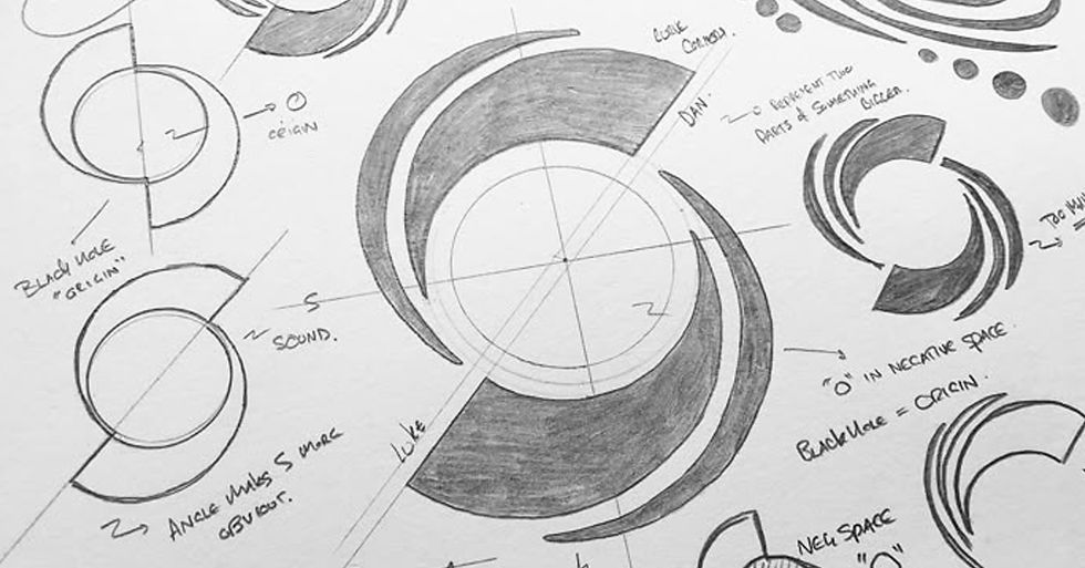
These are some great examples of good logos
TIMELESSNESS: AVOID THE TREND TRAP
Design trends come and go, but an iconic logo stands the test of time. If your logo screams “Designed in 2025!” it might impress today and look dated tomorrow. The goal is a design that still feels fresh and relevant in 5, 10, even 50 years. That means focusing on classic, enduring elements over fleeting fads. Think of the Coca-Cola script or the Mercedes three-point star – essentially unchanged for decades, yet still powerful. Iconic logos have a timeless quality built in. Of course, brands evolve, and small tweaks over the years are fine, but the key is consistency. Don’t redesign your logo just because you’re bored or chasing the latest design craze. Consistency builds recognition and trust. Commit to a great logo and give it the long-term love it deserves. Over time, a well-crafted logo that you’ve stuck with becomes more than just a design – it becomes part of your brand’s legacy.
Not every logo will reach the legendary status of a Nike or Coca-Cola, and that’s okay. But if you bake in simplicity, distinctiveness, meaning, versatility, and timelessness from the start, you’ll give your logo a real shot at greatness. An iconic logo isn’t just seen – it’s remembered, talked about, even loved. It embodies a clear purpose and it’s executed with conviction. So design with these principles in mind and then stick to your guns. Remember, even the best logo needs time and consistent use to grow into an icon. Aim for iconic, not just “good enough” – your brand deserves nothing less.
WANT SOME HELP IN YOUR BRANDING JOURNEY?

Here at Gianmarco Zanol Design Studio we are experts in logo design for brands, so let us help you grow you business brand! Contact Us!


Comments